In 1996, Summa began its journey as a band of software nerds; experts in building and integrating custom applications. By the early 2000’s, Summa had become a closer partner to its clients, enabling its development work to more closely tie to business objectives and outcomes. More recently, we have expanded upon our development and integration services to incorporate agile transformation strategies and human-centered design practices. Yet, through this evolution our logo and brand elements have not caught up. Until now.
We recently undertook a brand identity refresh to better capture the essence of our people, our culture, and the value we bring to our clients. Since rebranding is a common challenge, we thought you might enjoy a look behind the scenes at our approach.
Looking Inside Out and Outside In
We have a very open culture that respects collaboration and transparency. Our design team utilized our broad spectrum of employees and clients to help us look at ourselves from a variety of perspectives. We used the following techniques to provide focus for collaborations:
- Rediscovered our roots through brand workshops - we worked with a cross-section of employees to represent old and new, senior and junior, design and development
- Surveyed internal employees to learn more about where we’ve been and where we want to go
- Captured outside perspectives through client interviews
- Researched competitors to identify trends and anti-patterns
- Established an internal culture initiative
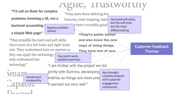
The questions we asked ourselves was “Who are we? How are we seen by our customers?” What we learned is that our people are what makes us different. But a lot of other brands claim this so it was our challenge to move past the generalities and make ourselves stand apart from the crowd. We started by creating affinity maps of comments from client interviews to find more tangible themes. Below are a few selected quotes and the high level groupings that emerged.
From the above customer feedback themes, we felt we could best express the concepts of partnering and problem solving. These were the focus as we started exploring our new brand identity.
“We aim to project Summa as fiercely creative, accomplished, thoughtful, and down-to-earth.”
— Emel Gomulka, VP of Marketing
The Initial Creative Struggle
As with any creative process, we wrestled with this challenge as we got started. Everyone had their own ideas and everything was on the table, except for our company name. In initial conversations we asked ourselves questions like, “Should we have a symbol or logo mark? Should we move away from our current color palette? Do we want to introduce an initial cap “S” in the company’s name?”
As a team we initially worked on very different visual styles and explored different themes for the identity. This “warm up” creative exercise was fairly open-ended. Below is a sampling of some of the initial work.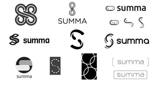 After two iterations of the identity work, we began capturing attributes of our explorations that we felt were core to our company. These attributes included:
- Different teams represented by different shapes
- Seeing the same object differently depending on your perspective, inspired by MC Esher’s work to create impossible objects
- Modular components that represent building blocks that combine to make a whole
- Creating an S shape that is more of an abstract symbol
- Somewhat technical style to represent our core and our roots
- A symbol that is larger than “summa” to represent our role on teams and our service to our community
- Puzzle-like feel suggests our problem solving skills
So, we iterated until a strong “ribbon” concept emerged. Its geometric shapes communicated technology and precision while the transparency of the shapes softened the symbol. The pieces were defined, but together they formed an “S”. And the “S” shape can be interpreted in a number of different ways as illustrated below. Depth, flow, motion, and overlap are all words that can be used to describe this mark.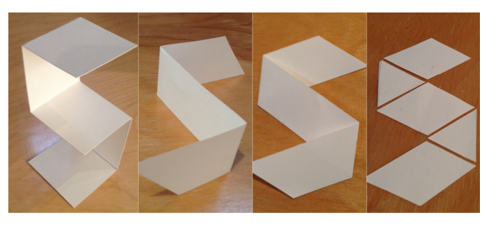 Next to the logomark, the all lowercase “summa” name feels friendly and approachable, has worked well and now is rendered using a new typeface.
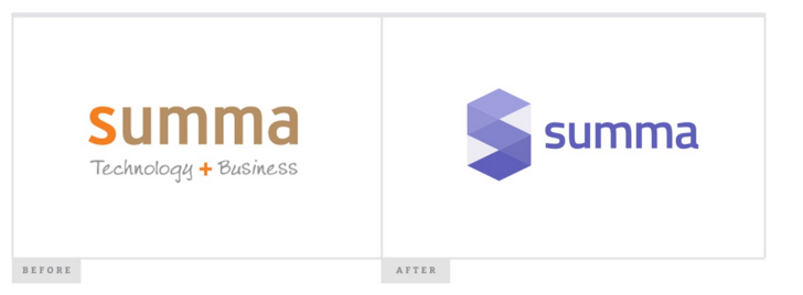 During our final iterations we applied our strongest concepts to web pages, business cards, and other collateral to view them in context. This helped us evaluate how the logo would render at different sizes and different resolutions, from print to desktop to mobile. It was also an opportunity to introduce color in a more intentional way to our work.
 We recently rolled out our new identity internally and to the world and it has gotten tremendous positive feedback and strong support. It is especially gratifying to hear that we were right on the mark capturing who we are and our culture through our new logo and the rest of the rebranding. To hear about our journey we embarked on to redesign our website, read our

