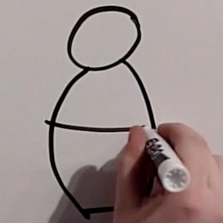
This is the second blog in a 4-part series that focuses on whiteboarding. Part 1 outlined the benefits of whiteboarding and how something so simple and low-tech can be so impactful. Now we’ll ease into some hands-on drawing exercises to build your skills and your confidence.
"It is not the strongest of the species that survive, nor the most intelligent, but the one most responsive to change."
- Charles Darwin
Change is hard. It’s certainly easier to retreat to our comfort zone rather than stretch and take on new things. But, you should know that there is no single “right” way to draw. To illustrate this point (#badpun) here is a compilation of some Summa designers each drawing the same objects and concepts, but in varied ways.
Now it’s your turn with a little help from a legend: Bob Ross. The video clip below shows Bob working his magic while I name some objects for you to draw. So, find a quiet spot with a whiteboard where you can play this video with the volume up. When I say each item, draw it. If you have time, try more than one variation. Try not to overthink it. Sometimes what comes to mind first is really iconic. And chances are it will resonate with your audience.
So, if you’re reading this, you’ve probably taken a crack at drawing. Perhaps you’ve struggled a bit as you’ve exercised new muscles and you’re ready for some tips. You’re in luck. Keep reading.
Get it Close, But Not Too Close. If you’re like me, you’ll never pull off a realistic rendering of something, at least not on a whiteboard. In fact, when your drawings are too close to the real thing people start to analyze them too much and get distracted by what you didn’t get right. It’s just human nature. More detail also means more work for our brains to process and this can detract from the larger story you’re trying to tell. Also, if you’re trying to guide a meeting or just keep up with the conversation, you’ll never have that kind of time. So, focus on the essence of an object and have fun with it.
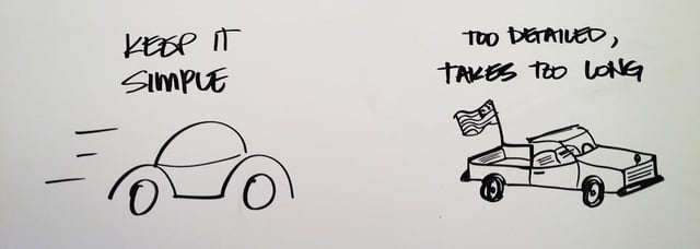
Make it Legible. In our world of texting and video chats, good handwriting seems to be going the way of the dodo. There will be times when you need to label things or add text to a diagram or drawing. Make sure the text can be read; a day or week later you probably won’t remember what that scribble really meant. And other folks that see the drawing, but weren’t in the meeting will have NO clue what it means. Take a few extra seconds to write legibly. It won’t make you look less cool. It’s really simple and super important.
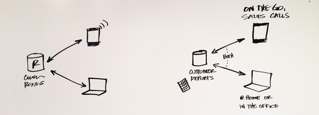
Watching Your (Visual) Weight. How big you make the “things” in your drawing, the space you leave between them, the hardness or softness of the edges and the thickness of the lines all work together to affect visual weight.
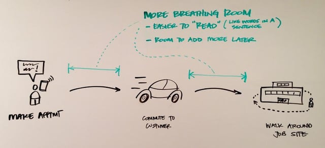
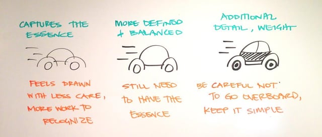
I’m only scratching the surface of this topic; there are some great reads regarding visual weight and “figure and ground” linked at the bottom you should check out. But, to keep it simple at first, use a cantaloupe as your reference for size and spacing. Each object you draw should be about that size and leave a cantaloupe or two between your objects. That will ensure you have room to add more notes around items. 
This is a good rule of thumb to use when you’re starting out. As you get more comfortable and you’re ready to take off the training wheels, adjust this to fit your own style and needs.
Be Careful with Color. Drawings with color seem more fun and interesting. And color is powerful in ways that aren’t immediately obvious. Our brains are pattern-matching machines and when we see drawings we try to solve them like a puzzle. We look for things that fit together to make sense of it all.
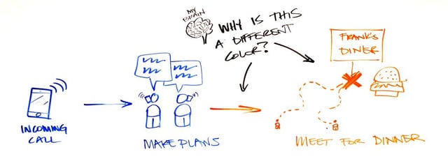
In the above diagram, orange is used for the dinner date. Our brains are working hard to figure out why it’s a different color and the meaning behind that choice, even though that wasn’t done with intent. So, using colors is tempting, but try using just 1 color at first. You can always go back and color things in or highlight them to create focus and associations.
Now that we’re limbered up, the next blog post will cover a handful of diagram types, situations where they work well and some examples.
Cool AND relevant links, Part 2:
- Design Principles: Visual Weight and Direction
- Visual Weight
- Gestalt Principles and Why We Search for 'The Whole'
- Gestalt Principles of Perception
- Connecting and Separating Elements Through Contrast and Similarity
- Napkin Sketch Workbook
- Back of the Napkin Sketch: Solving Problems and Selling Ideas with Pictures
